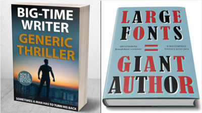
 BBC Arts’ Tom Churchill mocked up five publishing design clichés that pervade the book stands. From the airport blockbuster thriller, to the fantasy epic, to the literary prize-winner, he pulls out laughably bad real examples that have sold by the truck load.
So cliched, so true, and how they still work, despite the fact that you see the same covers repeated time and again for new books you think you already read.
Lazy design or tried-and-trusted power-marketing? Well worth a short read of this 2018 article re-published on the BBC website this weekend.
Thriller
The trademark silhouetted man with his back to the reader, walking away, alone. The protagonist is a maverick who doesn’t play by the rules and does things his own way.
Literary Fiction
Big, bold, typography. That’s all you need. With or without some funky colours. It’s a refined and classy look, tht puts the author ahead of the title. “Bonus points if your title contains two words,” says Churchill.
Epic Fantasy
A sword. Possibly shields, dragons, crowns, or a single reptilian eye, possibly on fire. Don’t forget the shiny fantasy typeface.
Chick-lit
Nothing says Period Romance like the silhouetted woman’s head, in profile, sporting a bun. Adorn with an elegantly exaggerated serif’ed font, there’s your demographic. It covers everything from magical fantasy historical romance and classic literature. Hands off, boys, this isn’t for you.
Psychological Thriller
A staircase rises. Figures ascend the stairs. Bonus points for mysterious figures in silouette. Extra bonus points if one is a child led by the hand. Double points for the word ‘lies’ in the title and/or ‘gripping’ in the strapline.